Wednesday, 4 April 2012
Sunday, 1 April 2012
Final finished Short Film
This is my final short film finished with focus group and feedback taken into account and with finished final touches with the editing all finished :)
Thursday, 29 March 2012
Final Focus Group
I showed two people from my focus group, Rhea (aged 19) and Ryan (aged 18) my short film to get their reactions and for them to answer a few questions with constructive criticism and honesty. I let them watch it first with me not in the room and then went in and filmed them watching it again allowing them to pause it whenever they felt they wanted to discuss something they felt was important. I liked this way of doing it as they could openly talk about anything instead of being restricted to certain questions and they can talk about it as its happening rather than having to remember it all. The only problem with doing it like that is it might mean the more quiet shy people wouldn't talk and contribute as much but luckily for me my two people were happy enough to talk to me and the camera comfortably. It was interesting finding out what they thought of it as they are my intended audience that I was aiming for.
I'd edited it slightly and cut out some of what they said and noticed I missed out something that Rhea had said that was quite beneficial. She said that she could imagine my poster to be put in an independent cinema leaflet, for example for Cinema City or in a leaflet/booklet for advertising the independent and individual aspects of Norwich.
I'd edited it slightly and cut out some of what they said and noticed I missed out something that Rhea had said that was quite beneficial. She said that she could imagine my poster to be put in an independent cinema leaflet, for example for Cinema City or in a leaflet/booklet for advertising the independent and individual aspects of Norwich.
Tuesday, 27 March 2012
Final Film Poster

The changes I made to the final film poster :
- I added the PG age certificate to ensure people who watched it were aware that whilst it's quite innocent, its still not completely suitable for children under the age of 8 because of its morbid storyline and death being shown which could be a little distressing and confusing for them.
- I ensured it had a realistic release date in the theatres, even though it will be only released for a few screenings at art house cinemas such as Cinema City because of how its a short film and might only be shown at short film festival viewings.
- I made sure it flowed by doing white lines that enclosed (boxed-in) some of the letters and linked the tagline "when life gets a little.."
- I included a photo of one of the props (box-head) to link in with the film and magazine review.
Saturday, 17 March 2012


Thursday, 1 March 2012
Final recording of the song and editing

Rhea concentrating hard on playing the song by Beck on her piano whilst I recorded it from microphone onto Garage Band.
 |
The professional microphone I used to put near the piano as she played to pick the sound up well and not pick up too much background noise.

Using Garage Band I edited the song that I recorded with Rhea and her piano. I had to drag the pieces of individual music I recorded together so it fitted and sounded as though it flowed.

To cut out any of the sound that was made after or before her playing, for example me saying stop or go, I had to click on the particular clip then onto Edit along the top then on Split.

This would then split the clip so I could then highlight that and then press the back button or delete button to get rid of it.

Because I think the piano sounded too plain and not professional and surreal enough I decided to edit and change the sound by adding an effect to it so it sort of sounded like another instrument, this distorted it slightly and gave it that edge I wanted.

I chose two parts of my song to be in Wave Bass and the other in Digital Horns, this changed it a little to give definition to the chorus and verses.
As the final thing I done to it, I decided to sing in it because I wanted the line "everybody's gotta learn sometime" to be in it as though its a message in the film. I only sang in one bit as I wanted the main focus on the piano music and how its very repetitive which reflects the characters in the films lives.
Monday, 27 February 2012
Recording the Song and Rhea
Tonight I am attempting to record Rhea performing on piano and singing my chosen song "Everybody's gotta learn sometime" by Beck. I didn't want the hassle with all the copyright business so decided to get a friend (Rhea) who is a professional musician and music student to help me.
We met up and talked about what I wanted from her voice and then decided to just use a piano for the backing music.
As a way of recording on my Mac I can either record through photo booth, through iMovie, through garage band or record it on a recording device and then upload it to iMovie as an audio file.
Luckily, Rhea has a microphone that I can plug straight into my Mac and then record straight onto Garage band were I can then edit it to how I would like it.
Problems we encountered tonight :
- Hard to find the right key that fits in with how I wanted and imagined it would sound, whilst still fitting in with Rhea's voice style.
NEXT TASK : meet up with Rhea again after I have tried recording the song myself and then finding the right key on the piano to match and recording the piano onto a different layer on garage band and then editing them together.
 A picture of the music Rhea was using, she had got the sheet music from the internet, but had found the guitar tabs etc to be too hard to play so opted to play it on the piano instead. I was ok with this as I liked the sound it made and it worked well :)

You can see me on the left holding my laptop. I wanted to take some photos of her playing etc, sort of documenting it. But I didn't have a camera with me so instead I took the photos using the built in webcam on my laptop using the program photo booth.
 Rhea playing the piano and singing.


You can see me on the left holding my laptop. I wanted to take some photos of her playing etc, sort of documenting it. But I didn't have a camera with me so instead I took the photos using the built in webcam on my laptop using the program photo booth.

Friday, 24 February 2012
The Interview


I was going to do a podcast with the interview for people to listen to but I thought beings as its going on the magazine page for them to read it doesn't really need to be accessible through listening. Plus it was hard to get more time with the person I was interviewing and was a long process to then upload it and convert it to a file on the internet to then go through web syndication or stream online to a mobile or computer device. (All of this use of technology scares me slightly so it didn't really appeal to me doing it through this process anyway ).
Thursday, 23 February 2012
Interviewing For My Ancillary Product- Film magazine review page

For my film magazine review page for my ancillary product I decided to do a two page spread, a film review for my short film on one page and an interview with a fellow student Katharine Wood on her feature length film (she actually done a teaser trailer).
It was a deliberate decision to use Katharine to interview instead of a real professional as I wanted to use intertextuality, using her and her products to help me in my film review in a magazine and in return helping her in advertising her product and it made her feel more proud about her work and as though all the hard work she did was worth it.
Sunday, 19 February 2012
First attempt at Film poster
Using Paint.net I edited a photo I took of one of the actual props (box-head) to use as the basis of my film poster.
My first edit of the poster .... and I encountered some faults and missing things with it. I also asked a few people from my target audience of what they thought of it and if they liked anything or if they could see any improvements that needed to be made.

Sam (19 years old) : "I like the surreal oddness of it, your design is simple yet effective and colours work nicely together. The only thing I would change would be the writing saying all the roles people played in the film at the bottom as I can't read it. Also its missing some conventional things you'd expect to see on a film poster"
On closer inspection I had missed out the age certificate, the star rating and a quote from a film magazine.
Friday, 17 February 2012


Thursday, 16 February 2012
Film Poster Research
I wanted to make sure I included every element in my poster that is usually seen in a professional film poster advertising a film.
I searched in google 'film poster deconstruction' and this is what I found.
This slideshare is useful in showing me the different things a film poster could involve and showing how the film poster could be seen with its hidden meanings and messages, for example the colours could signify something or be seen as symbolism.
http://www.slideshare.net/HigginsPlumb/film-poster-deconstruction-by-holliejade-higgins
Film Poster Deconstruction by Hollie-Jade Higgins
Obviously I realised that because mine is a short film it doesn't necessarily need to have everything as short films aren't usually seen advertised in busy public places such as where billboards would be or in newspapers/magazines etc. I'm aiming it more to be shown on the internet perhaps on independent film websites.
I searched in google 'film poster deconstruction' and this is what I found.
This slideshare is useful in showing me the different things a film poster could involve and showing how the film poster could be seen with its hidden meanings and messages, for example the colours could signify something or be seen as symbolism.
http://www.slideshare.net/HigginsPlumb/film-poster-deconstruction-by-holliejade-higgins
Film Poster Deconstruction by Hollie-Jade Higgins
View more PowerPoint from HigginsPlumb
Obviously I realised that because mine is a short film it doesn't necessarily need to have everything as short films aren't usually seen advertised in busy public places such as where billboards would be or in newspapers/magazines etc. I'm aiming it more to be shown on the internet perhaps on independent film websites.
Tuesday, 14 February 2012
Analysing Film Posters... number 2

One of my inspirations when it came to films was 'Eternal Sunshine of the spotless mind'(2004, directed by Michel Gondry). When finding the film poster I was instantly attracted to its striking surrealism, the elements that I saw was what I wanted in my own poster. I love the grainy 35mm film like photos texture and the fact that you can see 3 of the main characters. The layout is interesting and a new fresh idea that I've never seen before. It's very postmodern in the way of it being paper, recycled with the ripping over the eyes, covering them from the truth, yet hiding their identity. The quotes/taglines covering their eyes link to the plot of the film and give insight to an audience who are perhaps naive to the film.
I don't necessarily like the yellow colour of the title and tagline at the top. I think it looks too garish, attracting the eye away from the photos, which I think should be the main focal point (but maybe that's because I'm a photographer). The pun tagline at the top are clever in giving a little away, but not a lot. I think on my film poster I would like a clever sounding tagline to draw in my target audience.
I think the target audience that this poster was aiming at are people with perhaps a more broader mind of accepting difference, acknowledging the hidden meanings and thinking about things, analysing it, not just looking at it. More for the active audience and not the passive audience. Perhaps age range would be from early 20's to late 40's. Also as Gondry has released previous films his fans and followers would view this poster with great interest.
When thinking about where this poster could be advertised, I thought maybe the sides of buses or billboards as it would look striking and effective on a large scale, but because its more of an independent art house/indie film I don't think the budget for it would have stretched that far. Where it was actually advertised I'm not 100% sure, I'm guessing film magazines and in cinemas with the normal sized posters and perhaps online. It doesn't have an official website but this appeals to me more as not much can then be given away online.
In relation to how I want my film poster, I like the idea of the characters being shown, but on my own poster I am going to just show my main character but not all of him, keeping the mystery side of it still there. The reason of not having more than one character on my poster is because their faces (being boxes) look similar in drawn facial expression anyway, confusing the audience further.
Monday, 13 February 2012
Analysing Film Posters


Thursday, 2 February 2012
Where will my magazine review go ???
 An article from the Sight and Sound magazine which is an international magazine done by the BFI.
http://www.bfi.org.uk/sightandsound/newsandviews/news/issue-2012-02.php


Bright striking colours are used to catch an audience's eye and the fact that they use very recognisable photos from things mean people can relate. Sight and Sound magazine could be a possibility of me using it for my magazine article because of how it is an art house cinema stlye magazine, advertising some independent short film directors and their films. But I want to go for something different.... and so my search continues...
 I came across Empire magazine and looked at some of their interview layouts...
I liked how the red and blue complimented each other in this one but thought that how the woman dominated the page brought the attention away from the actual interview.
 This one in Empire again but it's too comical when it comes to the questions. It's not serious enough, and once again the photo takes up most of the layout.
 This one I prefer as it is an interview with a big director- Terry Gilliam.
 The colour scheme of blacks and whites and greys is something that I would want on mine I think.

 More colourful and warmer to look at, but the interview is with an actor and so I can't really relate it to mine.

 I love the simplicity of this layout and I have took great inspiration from it for my own magazine article film review, what with the information being displayed down the side and the screenshot from the film striking in its surrealness.

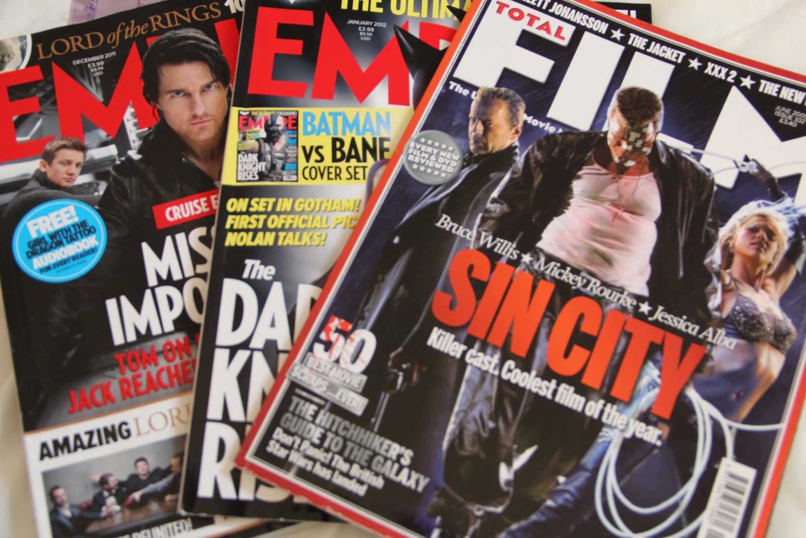
Some of the film magazines I looked through to find examples of interviews and film reviews to base my own on.
If anywhere, my magazine article would go in Empire but under a feature like a two page spread advertising up and coming British female directors (because they don't usually have articles on short films in Empire). Because the Empire magazine is Amerian I might need to show that the feature has a sponsor, for example it could be American Express as they sometimes sponsor stuff in it.
Also because Empire is aimed at a male audience they wouldn't necessarily want my feature to be in it so I'd need a sponsor to fund it.
 Taken from the magazine Total Film (which is still very much based at male target audience). Its very plain in layout and instantly the amount of writing puts me off slightly. You can tell its going to be a big interview/feature because of how his face on the right takes up the whole page.


I liked how the red and blue complimented each other in this one but thought that how the woman dominated the page brought the attention away from the actual interview.


Some of the film magazines I looked through to find examples of interviews and film reviews to base my own on.
If anywhere, my magazine article would go in Empire but under a feature like a two page spread advertising up and coming British female directors (because they don't usually have articles on short films in Empire). Because the Empire magazine is Amerian I might need to show that the feature has a sponsor, for example it could be American Express as they sometimes sponsor stuff in it.
Also because Empire is aimed at a male audience they wouldn't necessarily want my feature to be in it so I'd need a sponsor to fund it.


Tuesday, 31 January 2012
http://www.surveymonkey.com/


The email I received from them when I signed up to the site to confirm my email address.
I think this website and having an account on it is useful to me as I will be able to create surveys to put on facebook and other other social networking sites or through email to get wide demographics of people within my target audeince age range opinions and answers on surveys to do with my short film.
Useful stuff.
http://justcreativedesign.com/2008/05/13/how-to-design-a-movie-poster-with-an-example/
I found this website above to be useful in learning about the different stages there is in making a film poster, from the research to planning to the final thing there is a lot more thought that you'd originally thought.
http://asanda2mediastudies.blogspot.com/2010/03/how-to-analyse-film-poster.html
Once again, useful in reminding me how to thoroughly look and analyse a film poster. I learnt about the unique selling point and how the layout is could actually be clues to the films narrative. Also, a poster can tell you a lot about the genre of that particular film.
http://www.skillset.org/film/business/#

 This website is useful for the business side and different stages of film. I think sometimes people don't realise how much work actually goes into a film.
I found this website above to be useful in learning about the different stages there is in making a film poster, from the research to planning to the final thing there is a lot more thought that you'd originally thought.
http://asanda2mediastudies.blogspot.com/2010/03/how-to-analyse-film-poster.html
Once again, useful in reminding me how to thoroughly look and analyse a film poster. I learnt about the unique selling point and how the layout is could actually be clues to the films narrative. Also, a poster can tell you a lot about the genre of that particular film.
http://www.skillset.org/film/business/#


http://www.polleverywhere.com/


I like this website and i'm glad I signed up to it as I am now able to ask questions to my focus group/target audience and then get their responses via twitter, text message(SMS) or the web in real time and then embed it in my blog. I think this is an interesting and different way of viewing something and then being able to respond and reply to it.
Sunday, 29 January 2012
Feeling boxed in ?
When researching the title boxed in I decided to type it into Youtube to see what came up. This photo being the top one and the most popular was funnily enough quite ironically similar to my idea of my short film. This Youtube video is about the 2010 Census in America and how they ask you 10 questions to identify yourself. The narration asks 'feeling boxed in about your identity?' and then goes on to say stuff like 'be yourself' and 'because you count'. This reflects my short film as it is all about identity struggle and feeling trapped into being something that you're not, wanting to have the freedom that each individual deserves.
Saturday, 28 January 2012
Title of my short film. BOXED-IN.
I had thought long and hard about the title of my film and wanted to incorporate the main theme of no identity in it and the fact that they are having to wear box-heads on their head.
BOXED-IN
came straight to my mind and I instantly liked it. It has that feeling of being trapped which the main character regularly feels and has the word box in it.
To make sure I wasn't using another films name or bands etc and to make sure I didn't get done for copyright I searched 'boxed-in' on the internet... and this is what I found.

Luckily there looks like there is no film or anything that I could get in trouble with 'copying' as with my title of my short film I have purposefully done it in capital letters with a hyphen (-) between the two words. Also after it there is a full stop.
I found the dictionary definition very much reflects my storyline and how my characters seem enclosed in being something they don't want to be.

Thursday, 26 January 2012
A Focus Group
Focus group- Box Head from Bethany on Vimeo.
(When showing my clip the computer was being really slow and annoying and wasn't playing my clip smoothly, just wanted to make sure people knew it wasn't supposed to look like that)
I showed a group of people from the ages of 15-30 (my intended focus group's age) a short raw footage clip from my short movie. I decided to show them a clip in which you can see from the point of view of the main character (a fish eye lens is used) and the surreal box-head people. I asked them what their first reactions were and I think they were slightly confused by it, which is sort of what I intended and thought, I wanted them to have no understanding but just give me their first impressions with no prior knowledge. One of the boys said how there was room there for the audience to be asking questions in their heads.
I then asked them what they thought the plot might have been, and I liked the fact that one of my focus group knew straight away that it was from the point of view of one of my characters. Interestingly someone said it could be political based, as they associate political adverts with weird things "like boxes on their heads". Another said it could be linked with identity and categorisation. This same person made the assumption that my characters were wearing similar clothes, and whilst this was not my intention when choosing what costume my characters wore, I think it fits in well with how I want everyone one of my characters (what with the box heads) to look the same, with not much of an individual identity. The idea of taking the a clothing item or the box head off to "fight the power" is an idea I had previously thought of and was planning on using.
I asked does the silence annoy them when watching the clip. Most agreed no, as it adds mystery and suspense. My focus group followed my question up with a question of their own which I liked as it showed they were interested and wanted to find out more. They asked if there would be a score underneath. Obviously I had already thought about my options of sound and had decided on getting my musically talented friend to help my play and record an original song or my own version of a song already done. One of my focus group (a male) said it was good there isn't any background noise (diegetic sound) and I agree with this as it builds tension of the unknown, he also added it would be good if there was an eerie noise.
I really appreciated that a female from my focus group spoke up when I asked a question. She noticed and liked how it was and looked different to the norm. Another of the boys from my focus group cleverly noticed the enigma, making you want to watch more, and amazingly I even impressed another person (who is usually hard to please) as he would be interested in watching the rest of it.
I asked if there were any improvements that could be made, even though the clip I showed them was quite short. The lighting was mentioned, but as a good things, how it made it look realistic like every day life. He liked that even though the plot has a dark underlay, the lighting does not portray this, confusing the audience by giving them a red herring. I asked their opinions on it being edited to black and white as I wasn't too sure and they said it would be better in colour to keep it realistic as though it is the actual future. Maybe the only reason it would be in black and white would be for a reason- "does someone take their box off at the end?" Suggestions are that I could change it to colour/black and white with fuzzy blending as he takes off his box.
What I have learnt from this focus group is that they like my ideas, which is a plus, and they appreciate the surreal idea which is different from the crowd. They seemed to get my ideas which is what I was surprised about. Their interest in sound (diegetic or non-diegetic) made me realise how important it is to creating emotional response. I appreciated all of the input and liked that it was coming from both genders.
The only thing I disagree with what my focus group said was about the black and white. I want it to look bleak, their futures are bleak and so are their lives and so I want to reflect this. Editing/changing the black and white monotones with dull repetition of manner and style really match my box-heads characters lives, making it seem even more brave and rebellious to go against the regime that the government has imposed on them.
As an added bonus, I was proud of myself on this day as I overcame a technology problem with showing the clip as I had to convert it into a different file. When me, a technophobe, overcomes a technology related barrier problem, it is a good day :) .
More Inspirations & Influences
Walkabout from Bill Newsinger on Vimeo.
Whilst I won't be using the stop motion animation in my short film, this did catch my eye as its very well done as it looks quite smooth so its edited well and almost looks too good for just photos. It gave me inspiration to maybe try it one day for a little project on the side as I think it would be quite fun to do and you could have a theme, like for in this one its as though he/she is showing you where he lives, maybe his everyday route. I like the different sounds and underlay of music as it fits in time with the pace of the film/clip and has different electronic sounding elements to it which contrasts with the theme of nature. The fact that its all been done by him is a great boost to me, as it proves that good things can come from one hard working person.
My Life in a Day; San Francisco from Scott Hammel on Vimeo.
The second short film that caught my eye on Vimeo, it links with how I'm going to use a fish eye lens for my short film, to show the point of view of what my main character box-head is looking at. Once again this film is done in photos but I think it works lovely and the music once again seems very much in time, making me want to have a successful song/soundtrack. The music seems quite tribal and could represent San Francisco to be this urban jungle of creative nightlife.
 Luckily I'd got a fish eye adaptor for christmas so I could use it in my short film :)

I love the distorted effect that the fish eye lens gives, adding an instant twist to it.
Subscribe to:
Posts (Atom)